

Color psychology for painted garden pots is about how pot colors shape the way plants look and feel in a space. It helps avoid random color choices that make gardens look messy. This blog explains warm vs cool colored pots, seasonal color psychology for pots, and how to choose pot color for plants through simple steps that feel practical and easy.
Must Read: Floral Pots Design Ideas to Create Stunning DIY Home Decor
Let’s set the scene, not like a movie, but like real life. A garden corner looks fine. The plants are alive. The leaves are healthy, but something feels negative. It is not a plant problem; it is usually a color problem.
This is where color psychology for painted garden pots quietly steps in. Painted pots are not just holding soil. They are setting the mood. They decide if the plant looks clean and fresh, or dull and lost.
A pot color works like a backdrop. If it is too loud, it steals attention from the plant. If it is too bland, the plant looks flat. The goal is balance, not perfection.
Colors also shape the space. Warm shades pull the view closer. Cool shades push things back and create calm. Neutral shades make everything feel stable. This is not designing theory. This is just how eyes react.
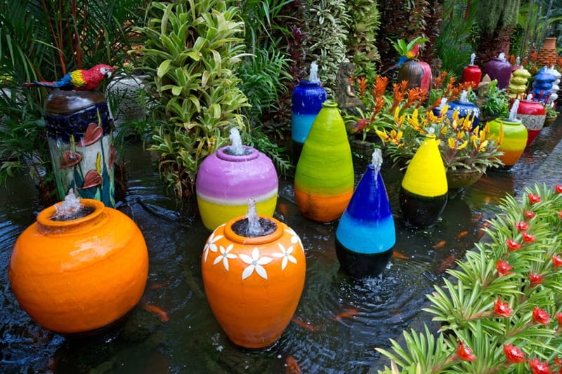
Warm vs cool colored pots can change how a garden feels without touching the plants. This section explains the difference in simple points, so choices become easier. The idea is not to overthink it. It is to pick what fits the mood and space.
The warm pots start with how they behave visually. Warm colors like red, orange, and yellow feel active. They pull the eye in quickly. That is why warm pots work well in entry areas, near steps, or in places where attention should go first.
Cool colored pots also differ in mood. Cool colors like blue, green, and soft purple feel relaxed. They make the space feel quieter. These pots look great in corners, near reading spots, or areas meant to feel peaceful and slow.
Warm pots also change the way distance feels. Warm shades feel closer, even if they are far. A small warm pot can feel “big” in a small space. This works well when a garden needs energy, but it can look crowded if overused.
Seasonal color psychology for pots is basically about matching pot colors with how the outdoor season feels. The garden's mood changes during the year. And pot colors can support that shift. The points below explain it in a simple and practical way.
Seasonal color psychology for pots works well with lighter shades during early growth months. Fresh greens, pale blues, and gentle yellows fit the softer light and new leaves. These colors make gardens feel fresh and clean, without feeling too loud or heavy.
Seasonal color psychology for pots changes when sunlight feels harsh and strong. Bright colors under intense light can look too sharp. Deep blue, muted red, clay, and darker neutral shades feel more stable. They reduce glare and keep the garden looking calm.
Seasonal color psychology for pots also supports the slow season when plant growth reduces. Earth colors work well here. Brown, tan, muted orange, and soft green feel natural. These shades match dry leaves and calmer outdoor tones, so the space feels settled.
Top Pick: Stylish Indoor Planters for Your Living Room and Decor
The following list will help you understand the process of how to choose pot color for plants:
Dark green leaves stand out in light pots like white, cream, or pale grey. Light leaves look cleaner in deep pots like navy, charcoal, or earthy brown. Contrast helps the plant look clear.
Bright flowers already attract attention. A neutral pot supports them well. Soft flowers sometimes need a deeper pot to avoid looking weak. This keeps the plant looking balanced when blooming starts.
Warm pots should be used where attention is needed. Cool pots should be used where calm is needed. This makes the garden feel arranged without being strict.
The process of choosing a pot color for plants is not only about the plant. The background matters too. Light pots look great on dark floors. Dark pots look strong against light walls. If pots blend into the background, plants lose their impact and look less clear.
Choosing the pot color for plants becomes easier when there is repetition. A garden with ten different pot colors looks messy quickly. A garden with two or three main pots of colors looks neat. Even with mixed plants, the layout feels controlled.
The process of choosing works better when seasonal color psychology for pots is considered. Neutral pots are great for year-round use. Feature pots can be changed by season. This gives flexibility, without forcing full changes every time.
Color Psychology for Painted Garden Pots helps gardens feel organized without doing too much. Warm vs cool colored pots guide mood and focus in a space. Seasonal color psychology for pots keeps the garden feeling fresh all year. With simple steps, how to choose pot color for plants becomes easy.
Painted pot colors help plants look clearer and more balanced. They also reduce visual mess in a space.
Seasonal color psychology for pots gives beginners a simple direction. Lighter shades suit early growth months. Deep tones suit strong sun periods. Earth colors suit slower seasons.
Yes, seasonal color psychology for pots can work without repainting all pots. Neutral shades handle most seasons.
This content was created by AI